Modernizing a Legacy Brand
Overview
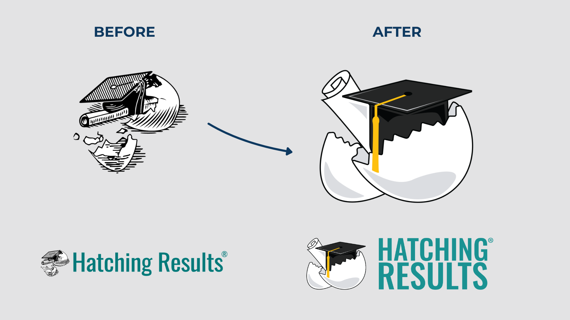
Hatching Results is recognized nationally as the premier provider of professional development for school counselors. By 2023, however, the company’s visual identity had not evolved alongside its reputation. The original logo, created nearly 20 years prior by the founder’s niece, had deep sentimental value but was showing its age.
I led a rebranding process to modernize the logo and formalize brand standards while respecting the company’s history.

The Challenge
The old logo, while meaningful, had become increasingly difficult to use in a modern digital landscape. Its detailed black-and-white line art didn’t scale well on mobile screens or print materials and no longer matched the energy of Hatching Results’ work.
Beyond these visual concerns, I wanted the brand to speak more directly to a new generation of educators and school counselors entering the field with expectations of a polished, contemporary organization.
My Role
Working directly with the company founder and a small leadership committee, I:
Initiated and managed the entire logo redesign process
Selected and collaborated with freelance designer Gary Gogis
Facilitated stakeholder input, balancing respect for the legacy logo with a push toward modernization
Expanded and codified brand guidelines, including typography and color standards, for consistent application across all company materials
This process included internal presentations, progress reviews, and even problem-solving around color calibration issues during the feedback phase.
The Process
Respecting the Legacy
Before proposing any changes, I spent time learning the full story behind the original logo from the founder and her brother, who was also involved in the original creation. This step allowed me to acknowledge its meaning while making the case for an update that would carry the brand forward.
Modernizing Key Elements
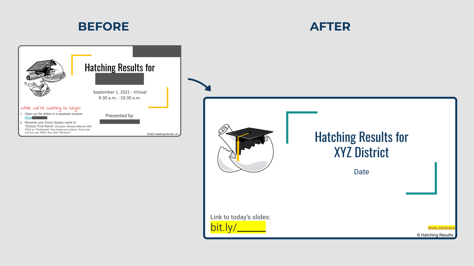
It was important to preserve the three core elements, the eggshell, graduation cap, and diploma, while simplifying the design for clarity and adaptability. We also added yellow to the tassel to give a splash of color. Overall we created a logo that works as well on a conference booth tablecloth as it does as a social media avatar.
Establishing Standards
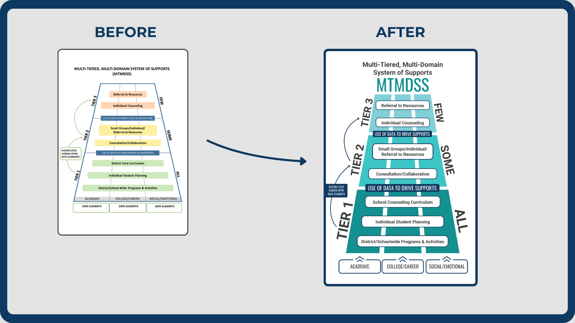
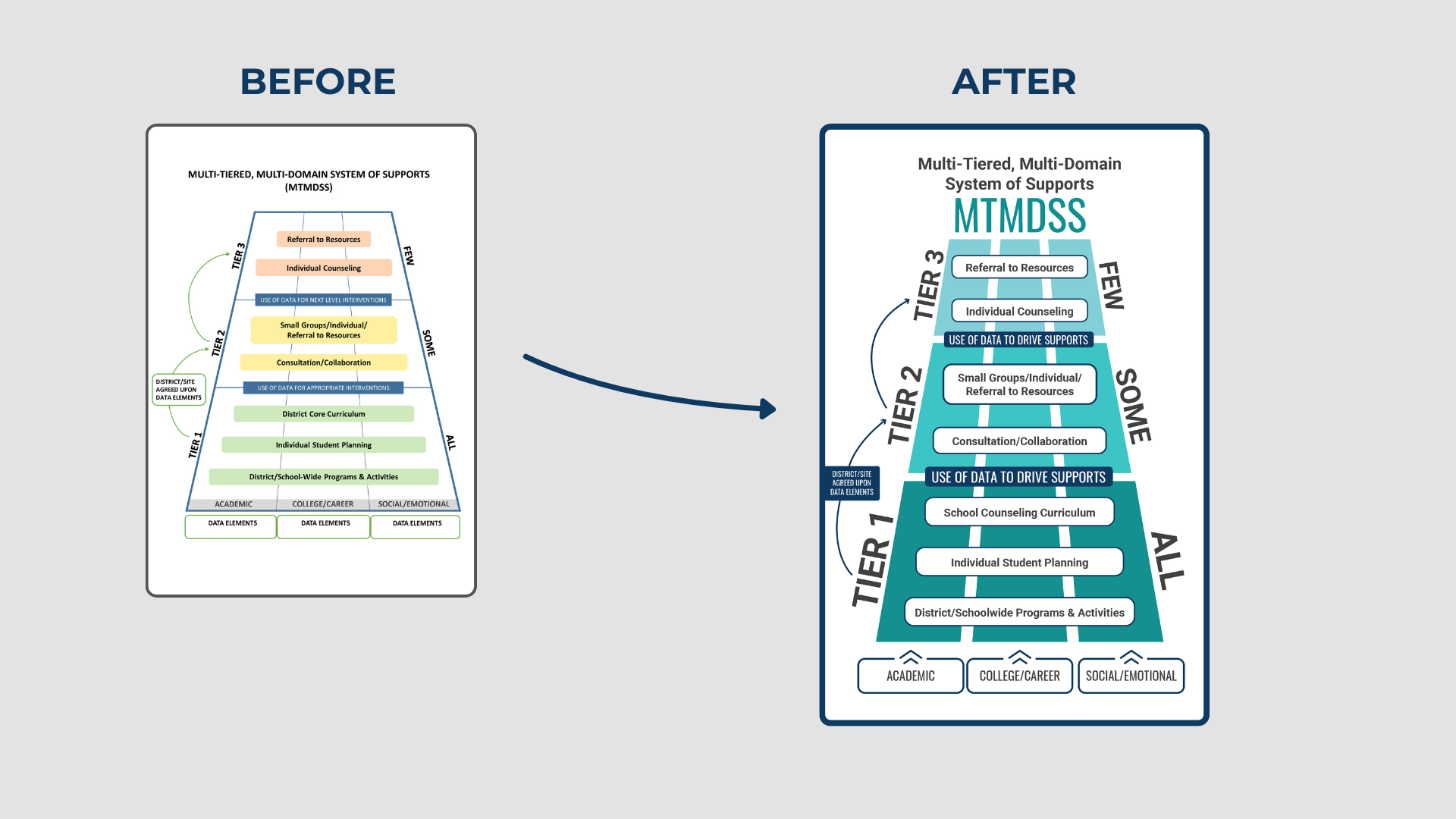
In parallel, I documented clear usage rules for fonts, colors, and spacing, ensuring brand consistency across all communications channels, and slide decks in particular represented a huge piece of the company’s client-facing assets.


The Results
The rebrand has unified Hatching Results’ visual presence across digital and physical platforms:
A refreshed logo that retains the history of the brand while appealing to modern audiences
Consistent, easy-to-apply design standards for staff company-wide
More impact and flexibility in conference signage, social media graphics, and presentation decks
Internal response to the new look was overwhelmingly positive. Staff and key stakeholders alike described the change as recognizably Hatching Results, but now modern.
Leading this rebrand required not just design judgment but sensitivity, patience, and the ability to bring people along in the process. The result is a brand identity that reflects who Hatching Results is today and positions them for the future.