Email Newsletter Rework
The Challenge
Hatching Results relied on a long-standing quarterly email newsletter to communicate with school counseling professionals. While not their only form of email marketing, it was the primary email communication piece for multiple years. Over time, the newsletter had become bloated with long text-heavy content, and had set a precedent for a basic subject line that seemingly capped its open rate. Key goals were to:
Increase cadence to monthly to cut down on content bloat
Redesign content strategy to intentionally link-off to our website on each story
Plan one “feature” piece to lead with each month that allowed for potent subject lines
Modernize the visual design

My Role
As Marketing Communications Manager, I led the full redesign of the newsletter format and content approach. This included:
Conducting an audit of past issues to identify weaknesses
Developing a new visual layout emphasizing clarity, scannability, and improvement brand implementation
Writing more concise copy with clear calls to action (and the webpages on the other side of those CTAs)
Coordinating with leadership to align content priorities and plan the monthly feature calendar

The Solution
A monthly cadence that enabled more total stories per quarter
Better visual hierarchy: larger hero images for key stories, clear pattern of buttons or hyperlinks, and more overt recurring sections each mont
Streamlined language to better tease clicking through rather than stories with text in-full
Let feature content guide the subject lines with more potential for adding value for the reader behind a clickthrough.
Implemented A/B testing for subject lines and calls to action to refine results
The Results
Higher engagement across multiple metrics:
After an adjustment period, open rates grew from 30-38% with the prior quarterly format to averaging above 50% with the new monthly format
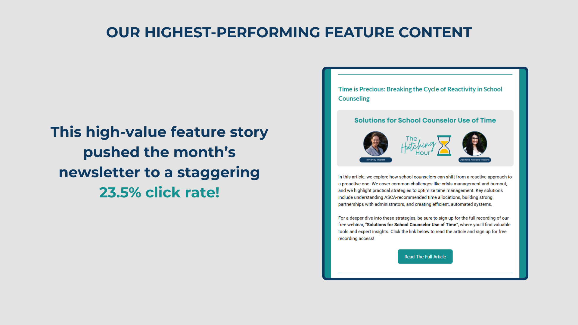
Click rates grew to a 9% average in the first year, with one high-value feature earning a staggering 23.5% click rate
Positive qualitative feedback from leadership and subscribers on the refreshed look and readability
Established a repeatable content workflow, making production faster and more consistent for the team
Why It Worked
This project combined design thinking with analytics, producing a visually appealing, mobile-friendly newsletter that now acts as a consistent, on-brand touchpoint for Hatching Results’ national audience.